Since pixel sizes are always whole numbers, you can simply use the percent scaling feature of your graphics software.
Scale any image to 74% width and 100% height to make it "Handbook ready".
If you’re reading this, chances are you have a Gateway Handbook 486 you’ve been using (or playing with). You know the Handbook is a great little machine for text processing. However, while its grayscale screen and just-slightly-off aspect ratio do not affect its ability to do that job, they do interfere with any graphics-oriented task. If, however, you’re determined to "teach the pig to sing" you can get some fairly good results when displaying pictures on the Handbook. This page will fill you in on the details.
You have to really know how color palettes work to get this. If you don’t know that stuff, go find it out on the web, then come back here. It’ll all make sense.
There are three hurdles to overcome if you want to get the maximum performace out of your Handbook when viewing images. If you are not interested in how these hurdles are cleard, but simply want to see the procedure you must follow, click here.
The Handbook 486 shipped with either an 80MB or 130MB hard drive, 4 MB of RAM, and Windows 3.11 installed. All of these specs are barriers to happiness in the modern world. Fortunately, you can do better.
The Handbook maxes out at 20MB of RAM. I highly recommend you max it out. The RAM is still available from various sources (try MundoCorp). I managed to get lucky. I had an older AcerNote Light Pentium-based laptop that died, and the 16MB chip from that machine worked perfectly in the Handbook. Anyway, 20MB is a real good thing if you can get it. Make sure you have the RAMINST utility and that you use it to kill the power to the RAM before upgrading.
Next, the hard drive. It can and should be upgraded. The Handbook uses a standard 3.5mm laptop hard drive. With the latest BIOS rev, you should be able to use any hard drive of a later vintage. 1Gig or 2Gig hard drives are pretty cheap and readily available on eBay. If you are running DOS/Windows 3.11 or Windows 95, only 503MB of the drive will be available, although Linux should be able to make use of the entire drive.
If you hare happy with Windows 3.11, congratulations. As soon as I upgraded the hard drive in my Handbook, the first thing I did was put Windows 95 on the machine, vastly expanding the options available to me for software, peripherals, etc. The OS runs well, although you may encounter some problems related to power management. (I may put up another page on this topic if I can ever get it figured out.)
While this page is based on the above baseline configuration (20MB RAM, 503MB HD, Windows 95 OS) the tips here should be applicable to other configurations as well. You’ll simply have to translate where appropriate.
One more thing – I’m assuming you’ve got more than one computer, and that you are using a graphics program on your other computer to prepare graphics for display on the Handbook. I use Paint Shop Pro, but Photoshop or something else will work equally well. The important thing is that the graphics program be able to smoothly resize images and that it support color palettes (indexed color). It must be able to apply a color palette to an image in two different ways: by dithering or error diffusing the image to adapt to the palette, and by applying a new palette to an existing palletized image while maintaining the palette indexes. (More on this below. If you’re confused already, it’s time to do that web research.)
The Handbook’s screen is limited to 640x480 resolution. However, the screen doesn’t employ the familiar 4:3 aspect ratio of most computer screens. The result is that the screen is stretched slightly in the horizontal direction. Draw a circle on a regular computer in a paint program, save the graphic as a bitmap and view it on the Handbook, and you find yourself looking at a flattened oval.
The easiest way to deal with this problem is to ignore it. Of course, if you were content doing that you wouldn’t be here, so...
Let's start with the basics. A normal computer screen has a 4:3 aspect ratio. That means it’s 4 “units” wide by 3 “units” high. On a VGA screen, you can consider 160 pixels as the unit. So 160 X 4 = 640 and 160 X 3 = 480 giving you the aspect ratio.
Divide 640 by 480 and you get 1.3333. The standard screen is one-and-a-third times as wide as it is high. This ratio holds true across the spectrum of PC display resolutions. (800 / 600, 1024 / 768, etc. all equal 1.333...)
Not the Handbook screen, though. Getting out my ruler, I measure the screen dimensions as 6.75" x 3.75". Divide the height by the width, and you get a ratio of 1.8. (or roughly 4:2.22 instead of 4:3)
So to compensate for the stretchy screen ratio, any graphics you wish to display must first be squashed in the horizontal dimension. Then the Handbook’s screen will stretch them out to look normal. The trick is figuring out how much squashing to apply.
Here’s how I did it. (Note that I'm terrible at math, so this may be the long way around. Math-heads can begin sneering now.) Assume you have a full screen (640 x 480) graphic that you want to adapt. Since the Handbook’s height-to-width ratio is 1.8, you can divide the width by this factor to obtain an intermediate height value:
Width 640 / 1.8 = Height 355.5555...
You multiply the intermediate height by the correct aspect ratio used on the standard computer screen (1-1/3):
Height 355.5555... X 1.3333... = 474 (rounded - actually 474.07406...)
This becomes the “corrected” height. You take the corrected height and divide it by the actual width to obtain a scaling value:
474 / 640 = 0.740625
So to obtain the Handbook width for a given graphic, leave the height as is and multiply the width by .740625.
Going back to your graphics program, you would take that 640 x 480 graphic, and resize it to 474 x 480. The graphic will then display correctly on the Handbook. For another example, if you have a 320 x 240 picture, you would calculate the horizontal scaling factor and resize the image to 237 x 240.

Since pixel sizes are always whole numbers, you can simply use the percent scaling feature of your graphics software.
Scale any image to 74% width and 100% height to make it "Handbook ready".
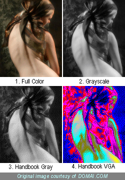
The Handbook uses the standard 16 color VGA display palette. If you view the screen on a color display (using a PCMCIA video card or remote control software such as VNC) you will actually see all 16 VGA colors. The specifications for the Handbook lists it as a 16-color grayscale display.
However, the Handbook has a bit of a dirty secret. It cannot actually display 16 distinct shades of gray. It is possible to construct a test image that demonstrates that the Handbook is really only using a 11 levels of gray for its display. This means that several of the VGA colors will display on the Handbook using the identical shades of gray. You can test this by creating an image with two colors – dark blue and light blue. On your main PC, divide a square in half with a light blue line and fill one half of it with light blue (RGB 0,0,255) and the other half with dark blue (RGB 0,0,128). Move this image to the Handbook and you will see a solid block of undivided gray.
What I have done is construct two optimized palettes for the Handbook. One is a grayscale palette that simply consists of 11 shades of gray moving from black to white. The second is an 11-color palette made up exclusively of VGA colors. These colors map to the levels of gray used by the Handbook, eliminating redundant colors. Here are the two palettes. They list the RGB values and the hex equivalent for each color:
| (000,000,000) #000000 |
(028,028,028) #1C1C1C |
(049,049,049) #313131 |
(074,074,074) #4A4A4A |
(102,102,102) #666666 |
(131,131,131) #838383 |
(152,152,152) #989898 |
(177,177,177) #B1B1B1 |
(206,206,206) #CECECE |
(230,230,230) #E6E6E6 |
(255,255,255) #FFFFFF |
| (000,000,000) #000000 BLACK |
(000,000,255) #0000FF LT. BLUE |
(255,000,000) #FF0000 LT. RED |
(255,000,255) #FF00FF LT. MAGENTA |
(128,000,128) #800080 DK. MAGENTA |
(128,128,128) #808080 DK. GRAY |
(128,128,000) #808000 DK. YELLOW |
(000,255,255) #00FFFF LT. CYAN |
(192,192,192) #C0C0C0 LT. GRAY |
(255,255,000) #FFFF00 LT. YELLOW |
(255,255,255) #FFFFFF WHITE |
To use these palettes:
Now you have everything you need to move photographic quality images onto your Handbook and have them look as good as is possible.
To review, here’s the whole procedure:
That’s all folks. E-mail me ( j i m _ d o r i a [at] y a h o o [dot] c o m ) with any comments.
|
* * *
|
 This work is licensed under a Creative Commons Attribution-NonCommercial-ShareAlike 2.5 License. |
